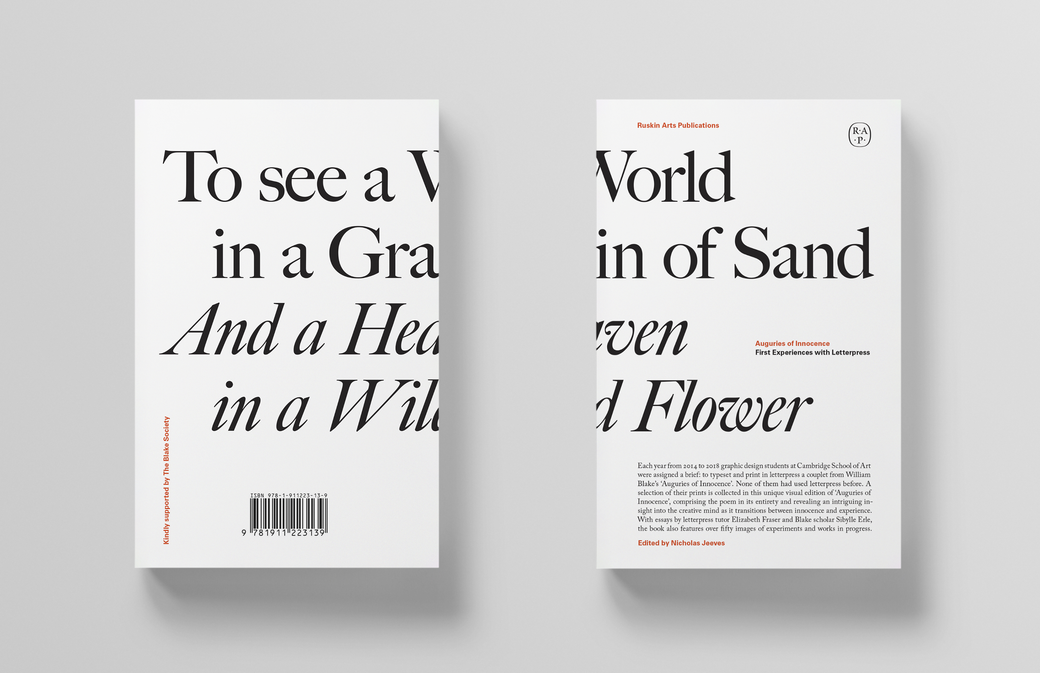
‘Cultivating Innocence’
Nicholas Jeeves
Introductory essay from Auguries of Innocence: First Experiences with Letterpress
Ruskin Arts, 2023
William Blake thought of innocence and experience as ‘the two contrary states of the human soul’, forever in flux. As our personal histories unfold we realise that we can have innocence or we can have experience, but we can’t have both: with every passing moment the one is consumed by the other. Often the changes occur within us regardless of our wishes, and with them there is cause for sorrow and cause for joy, for something lost and for something found.
Blake would later conclude that without these tensions there could be no meaningful human development. But the creative practitioner, if they intend to develop, must learn how to work across the two states — to cling to innocence while at the same time accumulating experience. They must find a way to become ‘experienced innocents’, to exist in a mode that allows them to explore new ways of thinking here, to capitalise on their gathering talents there, and to dance freely between the two to a rhythm of their own design.
When Picasso famously said that ‘It took me four years to paint like Raphael but a lifetime to paint like a child’ he was referring to just this idea. The creative practitioner’s constant endeavour is to hold the ‘two contrary states’ together in suspension, to enable the practiced hand to make unpracticed discoveries and to fix these moments within the frame of a painting, the form of a sculpture, or the margins of a page.
However unstable the paradox of the ‘experienced innocent’ might at first seem it is a way of being that can be cultivated. Indeed this cultivating is precisely what art schools are for and teachers will encourage it in their students in various ways.
For example, in my case as a graphic designer, whenever I am invited to counsel a student who has hit a creative dead end despite seeming to have done everything ‘right’, I advise them to try doing some things ‘wrong’. It is a game of What if?: What if I repeated that image? What if those images ran onto the next page? What if the next page was a different size? And so on. By deliberately doing it ‘wrong’ the creative may step out of the familiar ruts carved from experience and instead begin to explore new territories as an innocent. What occurs in these new territories is unpredictable and therefore exciting, and once something sufficiently interesting has occurred they may switch back to the experienced mind-state and make cautious corrections — cautious to preserve the genius of the innocent discovery, and cautious to resolve any obvious or unhelpful flaws.
Within this framework rules are not merely followed but invented, explored, tested, and kept for as long as they are useful or satisfying. It is the adult mind at play, no different in essence to the child’s game of What if?, in which temporary make-believe scenarios are conjured from the debris of everyday life. The only difference is that, as adults, we are now playing more grown-up, more nuanced, more sophisticated games.
Deliberately doing things ‘wrong’ is one way to inspire new ways of thinking and making, but it’s not the only way. Such useful shifts in perspective can also be brought about by introducing into our practice an unfamiliar process. In so doing we extend a formal invitation to innocence. And with that idea in mind we arrive at letterpress, and our students’ designs for William Blake’s ‘Auguries of Innocence’.
︎
The annual letterpress project we set our second-year graphic design students arrives at a useful moment in their careers. As primarily digital designers, and having acquired in their first year a variety of creative habits (both good and bad), they are introduced to a physical process that is quite alien to them.
A number of challenges immediately present themselves. These come largely from the inherent limitations of letterpress, which require a complete change of mindset: designs cannot be adequately prepared on a computer because the typefaces there are not the same as those kept in the type drawers; changes to a design are not made by the click of a mouse but by the painstaking disassembly and reassembly of physical matter; and printing occurs not by selecting ‘print’ from a menu on a screen, but by rolling a thin layer of viscous ink evenly onto a textured surface, gently laying over it a sheet of paper, and cranking a steel cylinder over the top to create an impression.
Overcoming such challenges requires an investment of time and effort before the results can be assessed and advanced. It is often slow learning. Slow learning, but sure: the letterpress novice labours between intuition and confirmation, between ambition and correction — between innocence and experience.
Accordingly, in 2014 when we were looking for a source text for the next iteration of our project, we might have selected Blake’s Songs of Innocence and of Experience. It would have been a suitable choice thematically but it was unsuitable practically: the poems are perhaps too long for a novice to typeset, and would not, we felt, respond well to being broken up across multiple prints. (They have also rather memorably been printed by Blake himself.)
Unlike the sequence of interrelated poems that form Songs of Innocence…, ‘Auguries of Innocence’ is a self-contained poem of 132 lines arranged, more or less, into 66 rhyming couplets. Importantly each of these couplets is endowed with a pointed integrity of its own, so that in isolation they may be read as standalone poetical proverbs. (One does not need to know, for example, the lines that gird ‘He who shall hurt the little Wren / Shall never be belov’d by Men’ to obtain a clear sense of its, and Blake’s, meaning.) The poem was also unprinted by Blake and unpublished in his lifetime.
Having chosen the text as printed in Poems (the Vintage Classics edition of 2007) we directed our designers to select a couplet and to reproduce it exactly — including the occasionally quaint spellings and Blake’s characteristic use of capitalised nouns. But as test prints emerged we found that this instruction was often being respected in only a very general sort of way.
In fairness there were some good reasons for this occasional lack of exactitude. One reason is that not all of the fonts we keep in our letterpress room are complete. While we have an amazingly varied selection, sorts will occasionally go missing and become too few in number to use more than two or three times in the same printing. Sometimes this hurdle was overcome by mixing typefaces, or by setting selected words in italics or capitals, or even by substituting glyphs (a zero for an ‘O’, an inverted ‘M’ for a ‘W’ or vice-versa). And why not? In the game of What If? the flow of play is what most matters, and one of the great advantages of innocence is the quick and unselfconscious embracing of a making-do.
This ‘jumpers for goalposts’ spirit enables and encourages play and thus makes room for creative inspiration. This in turn builds confidence and allays dogmatism, for while the typographer’s first duty is usually fidelity to the source text, the experimental mode requires allowances. If, for example, a designer at play sees an opportunity to bring a moment of visual emphasis or tension to a design, then using capitals could be a good way to do it. Again, why not, when the effects can be so compelling? Plucky visitors to the ‘upper case’ for this project include Martine Hansen [53] for the poem’s famous opening lines, Pedro Gualandi [55] for what is perhaps its most quoted couplet, and — most pertinently — Marleen Van de Velde [107] for the lines ‘If the Sun & Moon should Doubt / They’d immediately Go out.’
Other designers put capitals to work in their prints for quite logical reasons. Klara Block [98], in choosing to experiment with setting the type vertically (a precarious idea born of innocence) soon realised that, for optical balance, capitals are the only sensible design choice (a sound analysis born of experience.)
Similarly Evianne Verhagen’s design [60] also makes use of capitals but for strictly compositional purposes. In centring the lines she is connecting her design with the symmetries and complementary forces of the poem. But by setting two words in capitals she is also able to suggest a sacred geometrical symbol. Effecting such a shape was almost certainly not planned: instead it revealed itself in the making and was noticed by Evianne as a revelation worth protecting.
For her print Zahra Fontenelle [110] — like Blake, a Londoner — draws an imaginative connection between the streetwalkers of Blake’s London and the visual grammar of the city’s street signs. The result is a beautifully set and grounded bit of type with a bold and bright idea behind it. (I wonder if her use of ‘condensed capitals’ is a typographic pun? I hope so.)
Other designs feature some highly affecting departures from convention. In Jack Elsworth’s print [59] he evokes the ‘outcry of the hunted hare’ with an irregular and jarring combination of upper- and lower-case type, overprinted to create a vibrating drop-shadow. The effect is an outcry so urgent and so loud that it overwhelms the landscape, breaching the very edges of the page.
Sticking closely to the source text but still mounting a playful challenge to the brief, Natasha Livingstone [104] uses three printings in three typefaces and in three point sizes to effect a tangled knot of lines. The result is a visual riddle that nonetheless establishes readability: no mean feat. Similarly Sophie Potterill [105] who, with an intelligent understanding of colour and tonal values ensures that despite the density of her type, and an upended second line, we unhesitatingly read the couplet in the correct order.
︎
There are so many inspiring prints in this collection and there is something to marvel at in each of them. Indeed every time I engage with the prints, and the numerous experiments and works in progress, I notice something wonderful — some evidence of learning, a discovery fixed in print, these records of the first tentative interplays between intuition and spirited experimentation.
What we are really seeing in this book, then, is the record of 66 transitions between innocence and experience. You can also read ‘Auguries of Innocence’ from beginning to end as you might with any other printed edition. I think Blake would have liked that, both as a poet and as a printmaker. He might also have enjoyed these designs as sacred evidence of the young mind at serious play; and so might we.
︎︎︎ Back to project page